Chai-UI
Project: Open Source AI-native Design System
Roles: Creator / Principal Design Technologist
Year: 2026
Live links: Website · GitHub · npm Package
Description: Creation of an AI-native design system composed of smart components to rapidly build the front-end of applications that interact with various AI models
What's the Problem Being Solved?
Open any AI app and you'll find the same parts: a prompt box, an attach button, a model picker, an aspect ratio, an "enhance" button, a run button and a grid of results. Yet every team still builds them by hand.
Inconsistency: The same patterns behave differently from app to app, so people relearn them every time.
Repeated effort: Model selection, media handling, prompt writing and error recovery are rebuilt by every team.
No standard: Most AI interfaces are bespoke, built around one model's inputs and options, so the patterns never generalize across models or products.
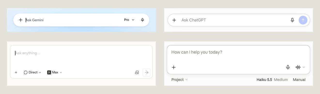
Who Are We Solving It For?
Chai-UI is built for the three groups that now build AI interfaces together: the designers who define them, the developers who ship them, and the coding agents that increasingly write them. Chai-UI is the design system I wish had existed when I was building UI for production AI apps and tools at Amazon. It would have saved me weeks, if not months.
How We Solved It
Design & Development Process
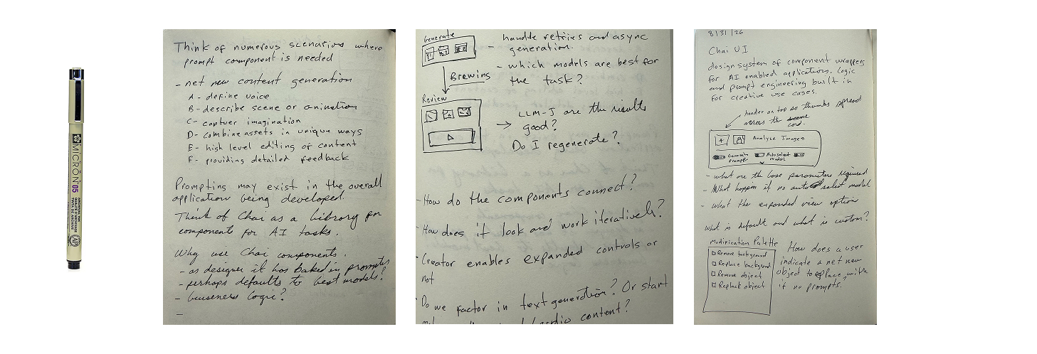
The ideas for Chai-UI started with pen and paper. Notes, sketches and concepts written down in a journal before a single pixel was pushed or line of code committed.
From there components came to life in Figma using Material Design 3 for basic components. Because Chai-UI is open source and designer-friendly, MD3 can be swapped out.
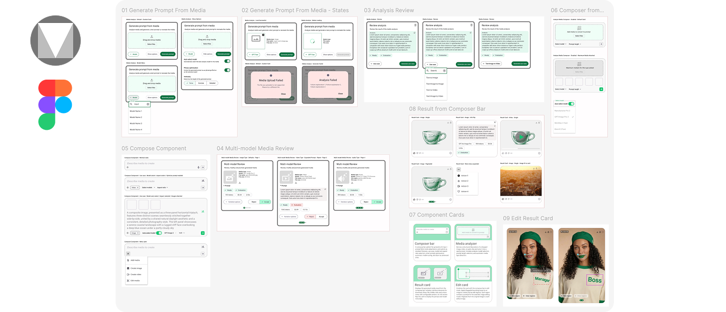
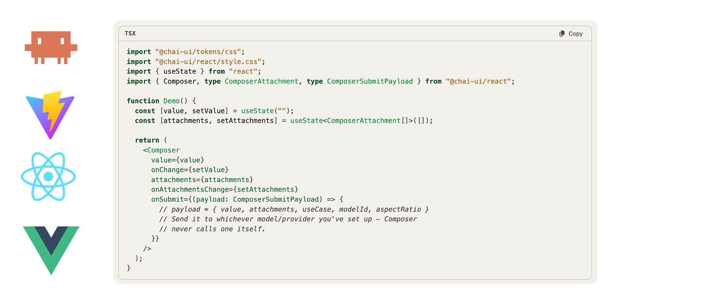
The development workflow utilized the sketches and notes to create a design document. It included Figma MCP and the Figma VS Code plug-in to create a two-way flow of designs. Claude Opus 5.5 was the coding agent, with React.js as the launch web framework and Vue.js planned for later releases. The docs site was built with Vite.
Chai-UI starts with the patterns people already know from the apps they use, then goes further. Each component knows which features and settings a model accepts and updates its controls to match, so one component works across many models and use cases instead of being built for just one.
| Pattern | Where People Know It From | In Chai-UI |
|---|---|---|
| Prompt bar with attach, model picker and submit | Chat assistants, image and video generators | Composer |
| Automatic model selection | Chat assistants with an "auto" model | Composer · model routing |
| Rewrite my prompt | Image generators, model playgrounds | Composer · prompt optimization |
| Drop in media, get a prompt back | Image-to-prompt and describe tools | Media Analyzer |
| Result with like, retry, download and details | Every generator and model playground | Result Card |
| Paging through one prompt across models | Model comparison arenas | Result Card · pagination |
| Mark an area of an image and say what to change | Precise image editors | Edit Card |
Baked In, Not Bolted On
The behaviors that teams usually rebuild by hand ship inside the components, so a working AI interface needs no extra loading, error or streaming state.
Model routing
Picks the right model for the request, or lets people choose. The UI only offers what the selected model can do.
Media detection
Recognizes images, video and audio on drop, and switches models and options to match.
Prompts, written for you
Each use case sends a prompt written for it, like region edits a model can place precisely. One tap also turns a thin prompt into a strong one, with undo.
Streaming results
Text arrives as the model writes it, and screen readers wait for the finished answer.
Evaluations
Your backend's quality checks show on each result as a clear pass or fail.
Retry and stop, in place
Failures turn submit into retry and in-flight runs into stop. No blocking error dialogs.
How It Fits Together
A composer collects the request, an engine runs it, and a result card shows what came back. The useComposer hook connects the three. Editing works the same way, with the edit card in place of the result card. Under the hood, Chai-UI is three packages with one job each, so teams can take as much or as little as they need.
@chai-ui/tokens
One JSON source of color, space, type and motion, built into CSS variables, TypeScript and a Figma token set.
@chai-ui/core
The framework-free brain: the request, run and result model, and the engines that call Fal.ai, OpenRouter or your own backend.
@chai-ui/react
Controlled React components and the useComposer hook that wires them to an engine.
Brew time. A working AI interface should take about as long as a cup of tea: install, point at a provider, drop in two components. The AI engine and the visual system are both replaceable, and today's look is Material Design 3, restyled through Chai's tokens.
What We Shipped
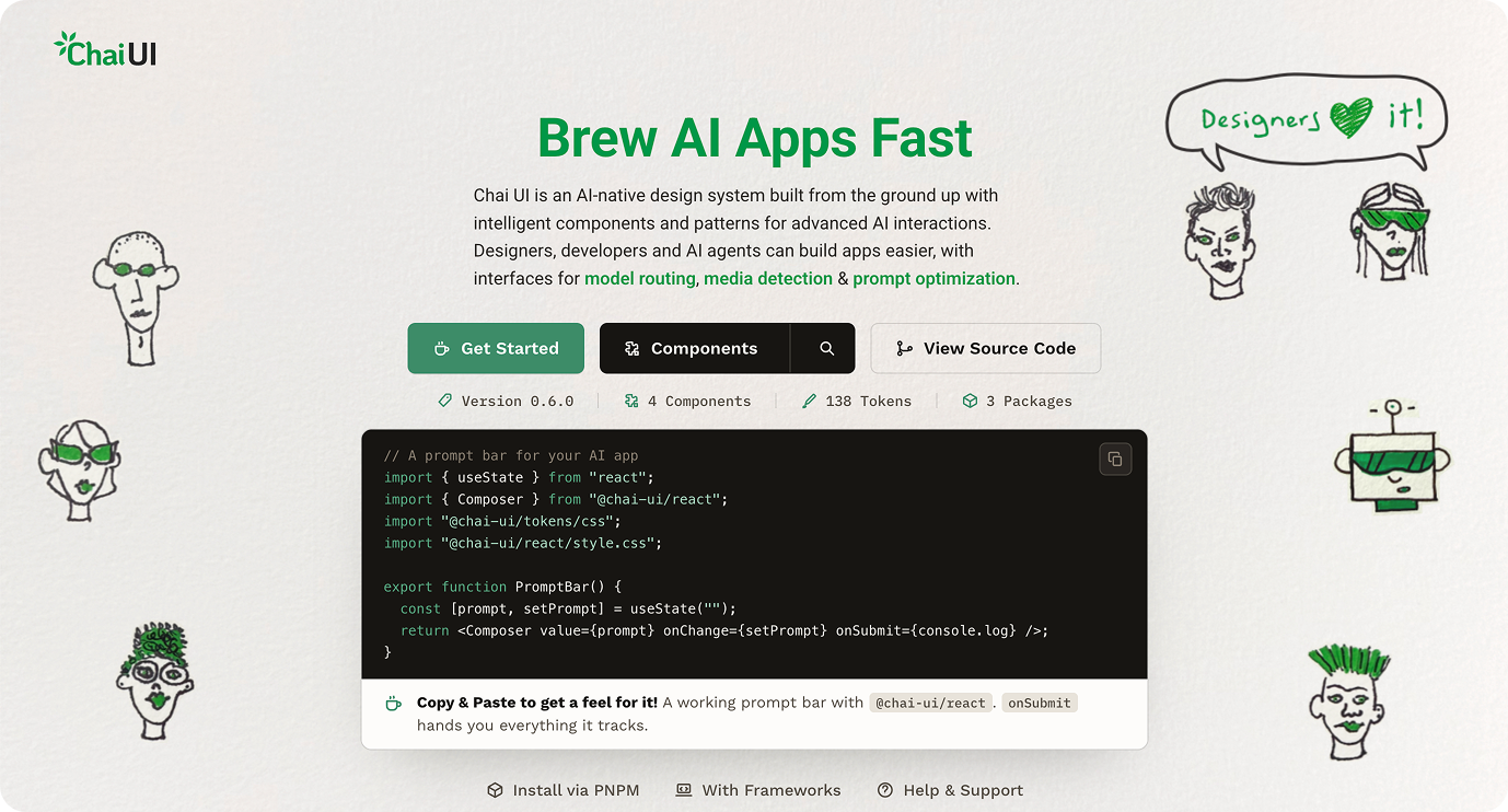
Chai-UI shipped as an MIT-licensed open-source project with its React package published to npm. It supports React 18.3 and 19, is built to WCAG 2.2 AA, and every engine is unit-tested against mocked providers.
Why open source: A design system only works if people adopt it, and adoption depends on trust and low friction. Teams can read every line, fork it, plug in their own engines and use it without a procurement process. AI models also change faster than any one team can track, so an open repo lets the people working with new models contribute the patterns they need.
Why an npm package, not another MCP: A package puts the components directly in the codebase. They're versioned, typed and tested, they render the same way every time, and there's no extra server to run or authorize. Coding agents still get first-class support through llms.txt and DESIGN.md, but they install and compose real components instead of generating new UI from scratch on every request.
 Open Source Repo
kazarazat/chai-ui
Source for all three packages, the docs site and the design tokens.
- MIT license
- Tokens, core and React packages
- llms.txt and DESIGN.md for coding agents
 npm Package
@chai-ui/react
Composer, Media Analyzer, Result Card and the useComposer hook.
–