Description: SkyKick is a cloud management software provider that helps IT partners and managed service providers (MSPs) automate Microsoft 365 migrations, cloud backups and security management, simplifying how businesses move data to the cloud and protect it against loss. This case study covers the redesign of the entry points to the enterprise IT SaaS: registration, onboarding and login.
WHAT'S THE PROBLEM BEING SOLVED?
SkyKick's registration forms had high bounce rates, and the customers who did make it through often came out confused navigating the signup and logged in experience, driving churn. Compounding the problem, the company had no reliable way to attribute which part of the UX/UI was actually causing that churn:
The primary and secondary registration forms had high bounce rates
Users were confused by the signup and logged in experience, resulting in high churn
Lack of ability to message customers or gain actionable feedback
No reliable way to attribute which part of the UX/UI was driving churn
WHO ARE WE SOLVING IT FOR?
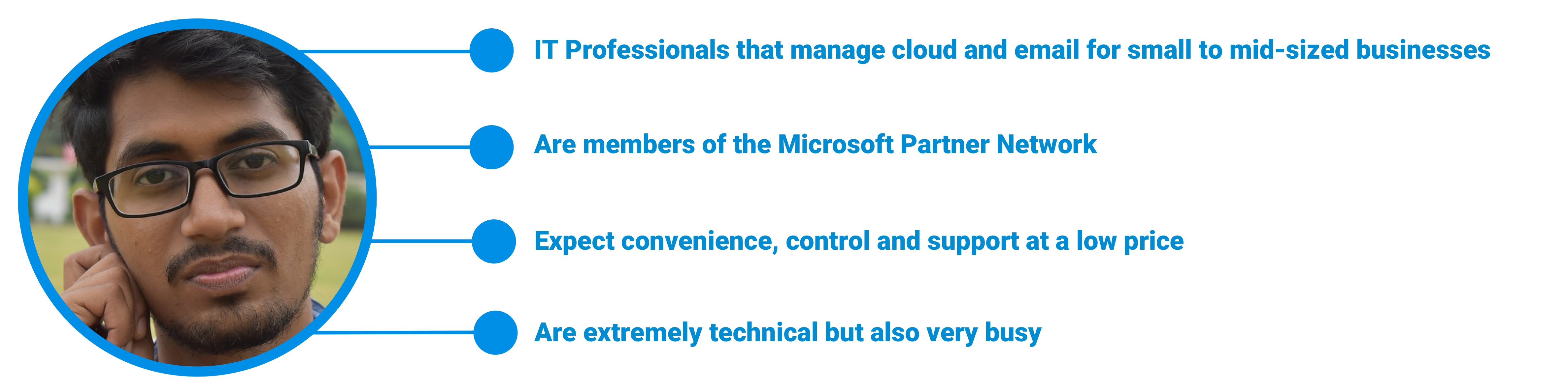
SkyKick's customers included large companies like GoDaddy, but the products were mainly used day to day by IT professionals, and they split into two groups with different needs: new customers working through registration and onboarding for the first time, and returning customers relying on their dashboards and journeys to manage services over time.
HOW WE SOLVED IT
I approached the redesign in four phases: auditing the existing product and data to validate the problem areas, defining new registration and login flows, developing a design system and high fidelity wires, and delivering the redesigned registration, onboarding and dashboard experiences.
Design Audit → Research → Flows → Design System → Wireframes
Design Audit
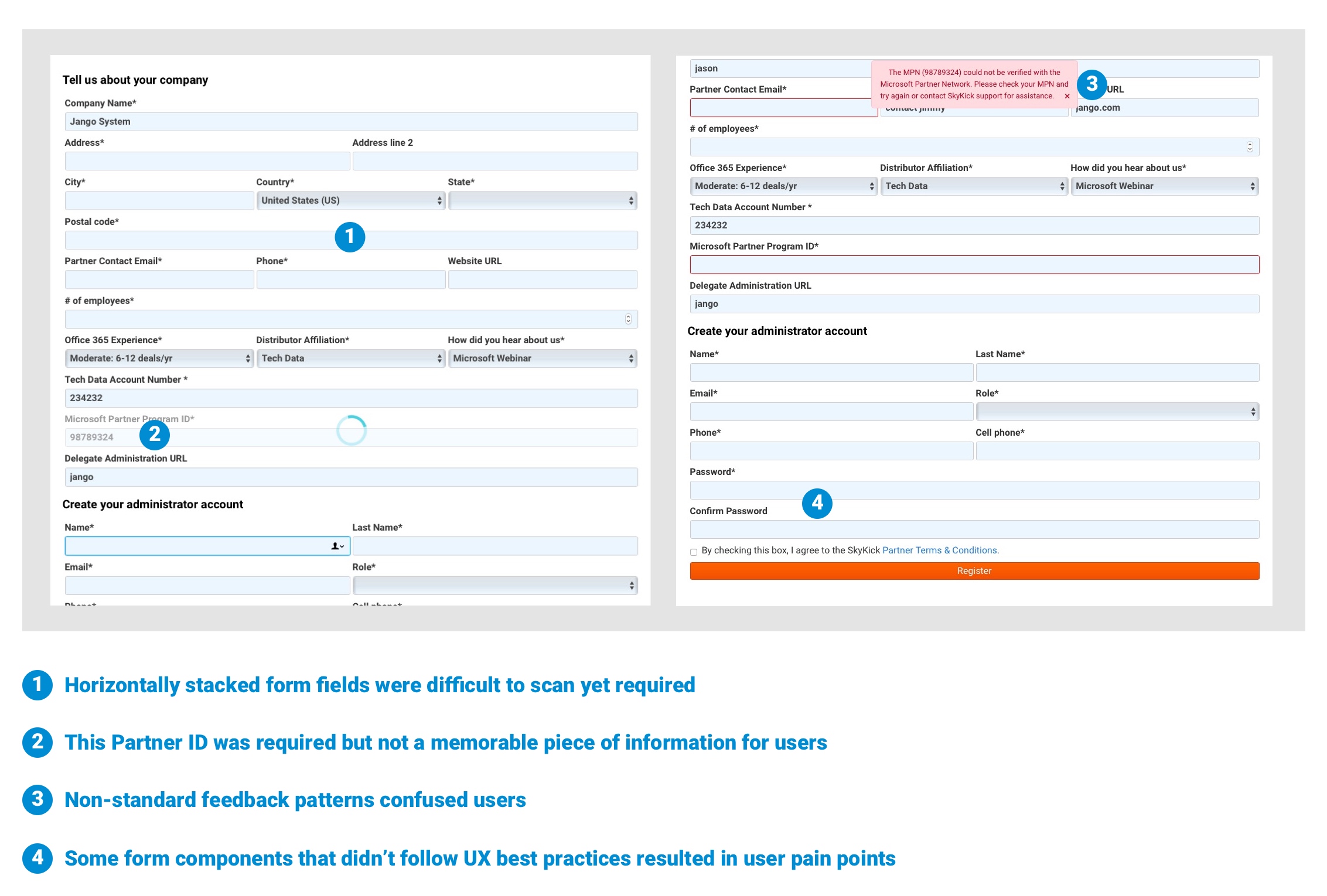
I conducted a thorough audit of the existing designs to validate problem areas.
Research
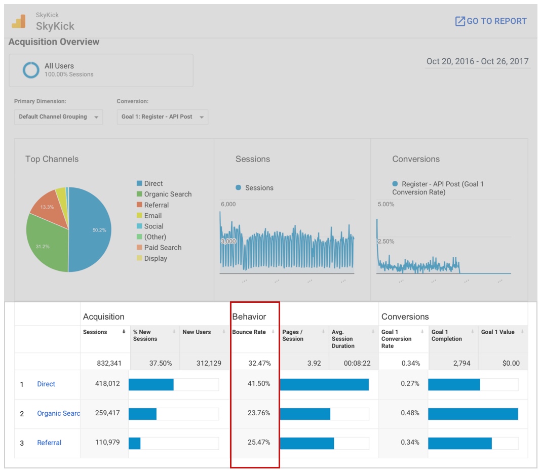
I looked into the Google Analytics data and confirmed that the registration bounce rates were high.
Then I dove deeper into that data by using a correlation coefficient to show that users who navigated directly to the site were more likely to bounce before completing registration than those who arrived via search. This helped validate the assumption that an improved registration flow and form could result in more conversions.
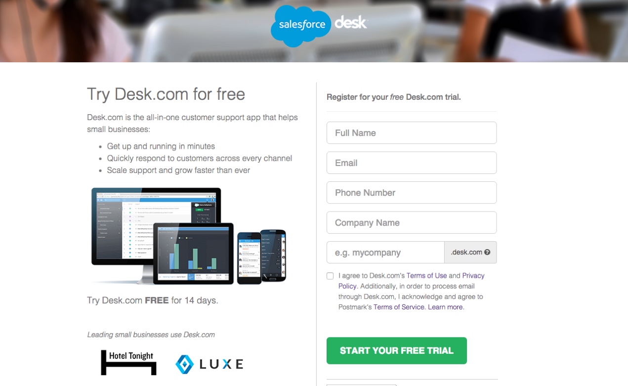
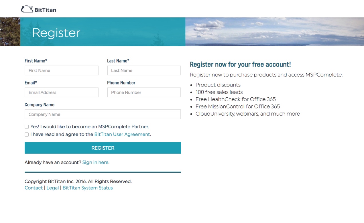
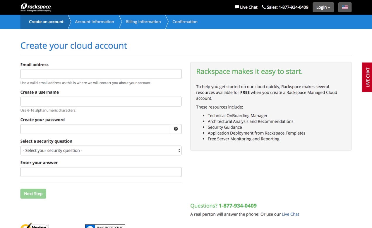
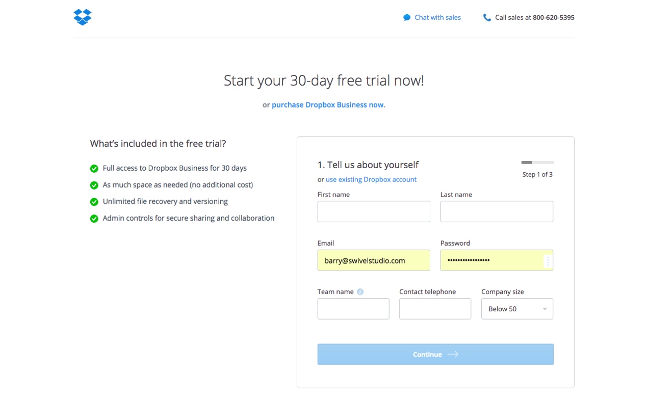
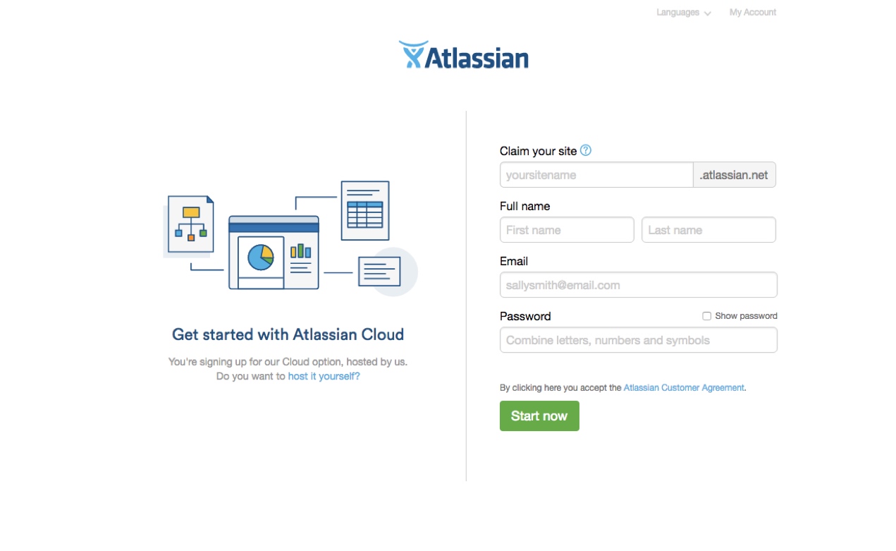
I researched the registration form patterns and practices for businesses similar to SkyKick, including its chief competitor.
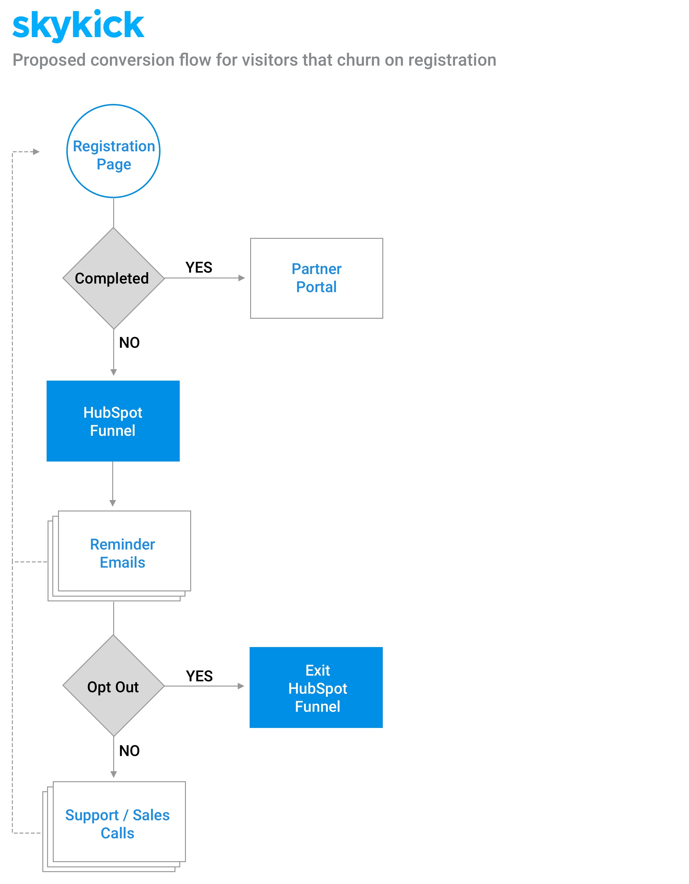
I used the insights from the data and user conversations, in concert with the goals, to formulate flows for the redesign of the new customer registration form.
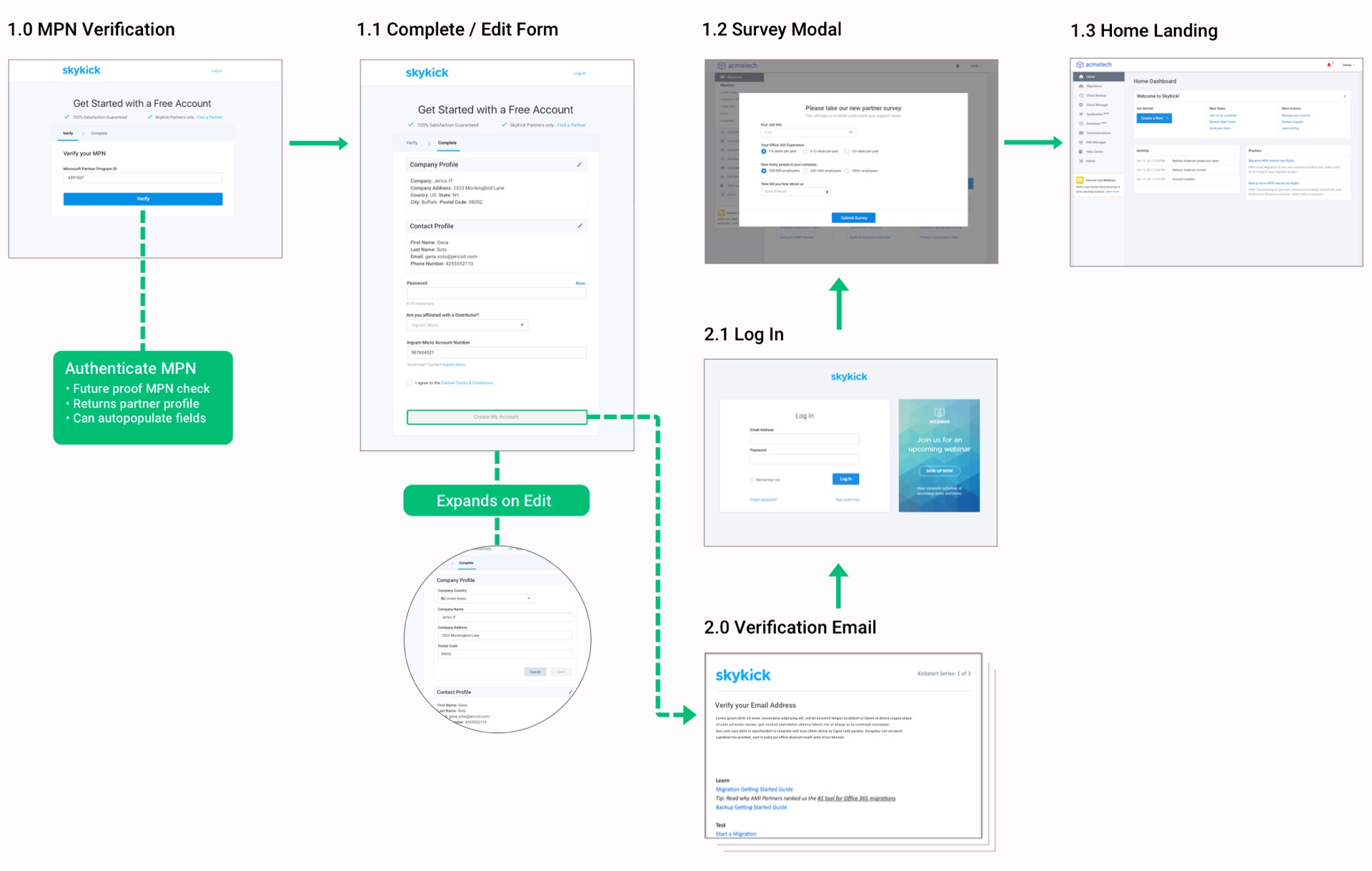
Optimized User Registration
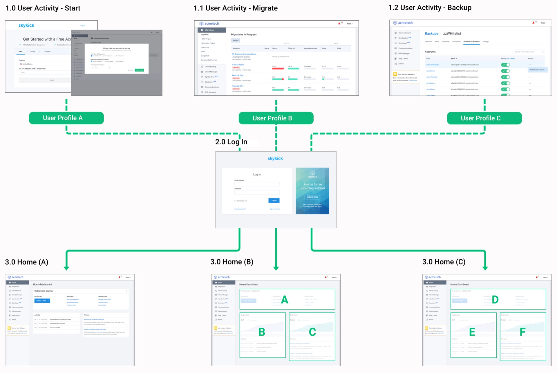
Optimized User Login
Design System
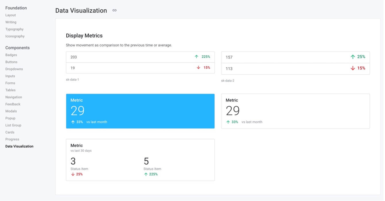
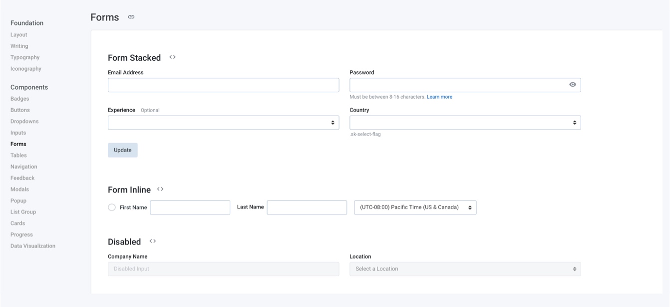
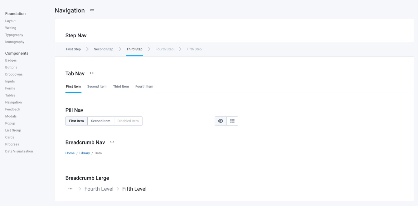
I used and contributed patterns to the SkyKick design system, which is built with Bootstrap.js and based on Material design.
The presence of a solid design system allowed for quick delivery of high fidelity wires and mocks.
WHAT WE LAUNCHED
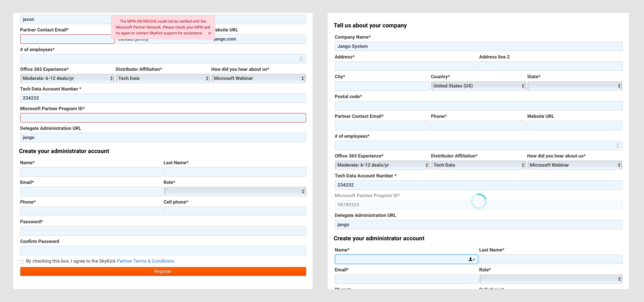
Previous New Customer Registration
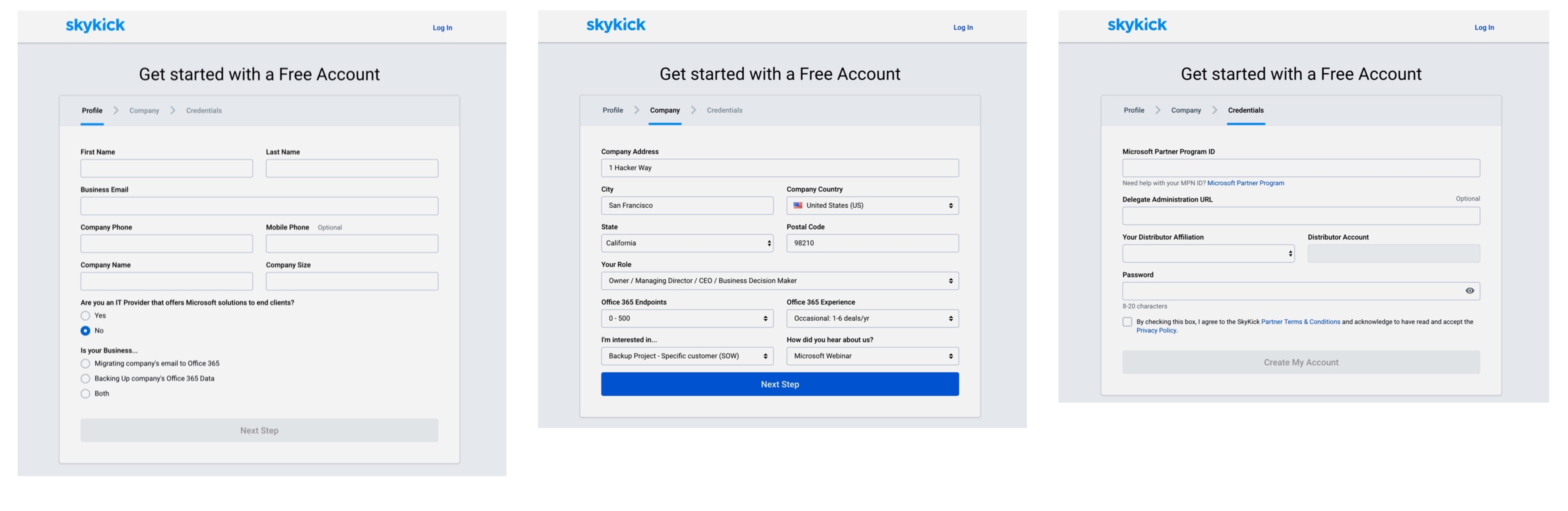
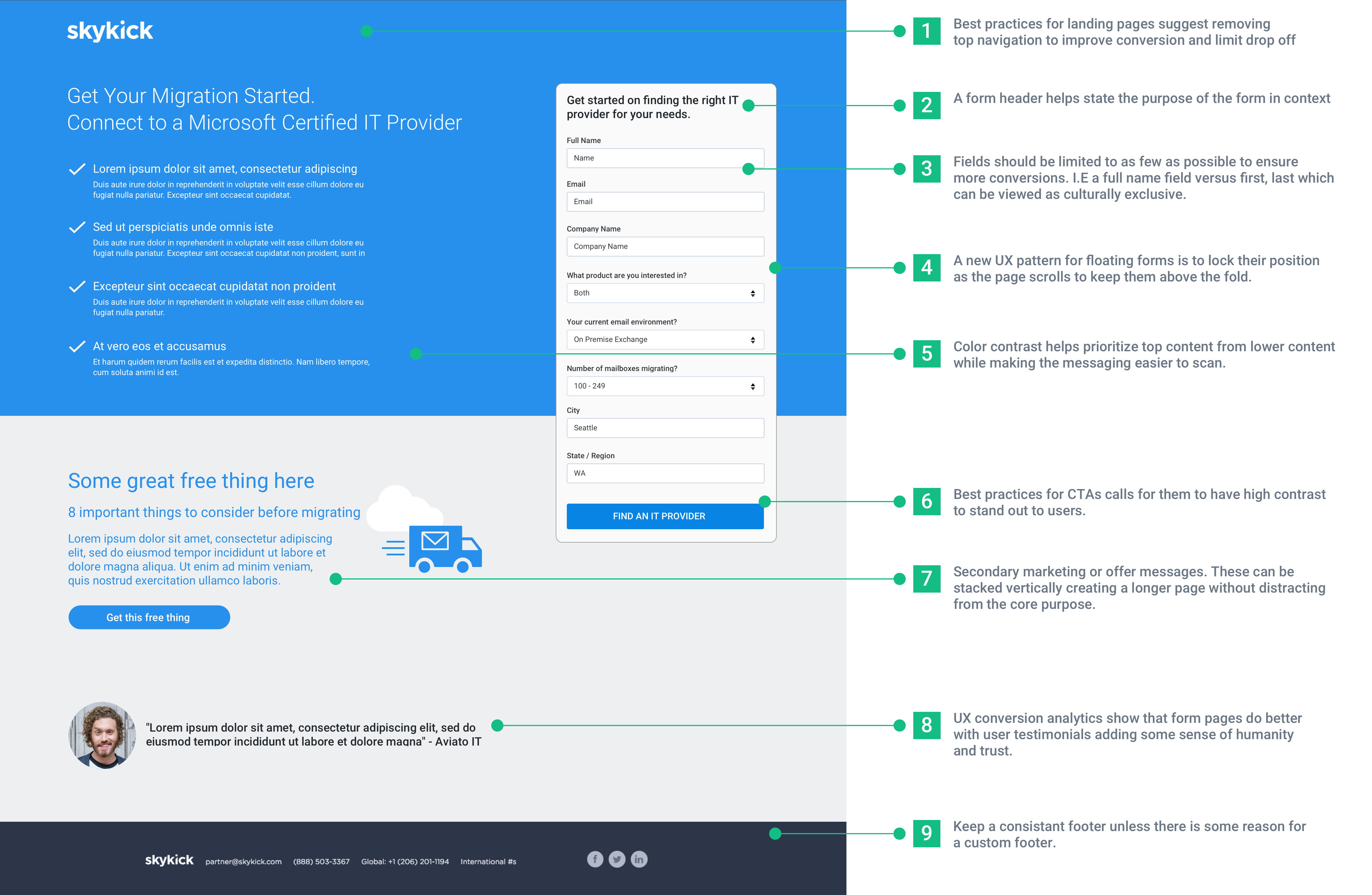
What We Delivered
What Improved
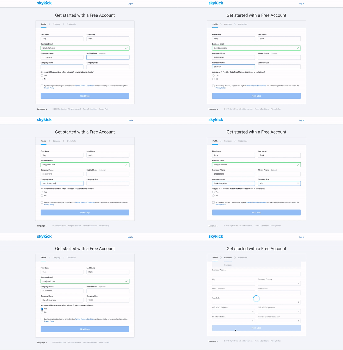
Segmented form is less visually overwhelming to users
Branching questions funneled non-partners to sales and support
The new design is responsive and more flexible for localization
Staggering the required MPN field led to lower bounce rates
Previous Partner Registration
What We Delivered
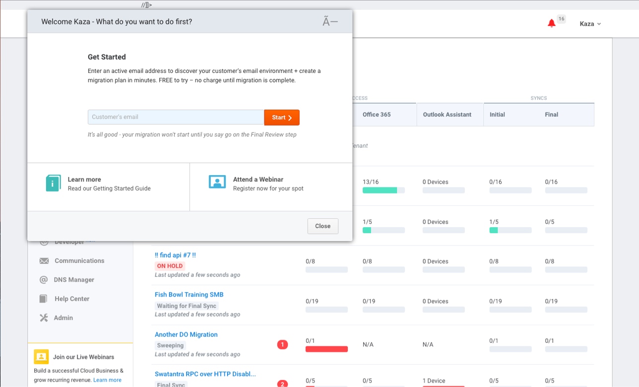
Previous Portal Login
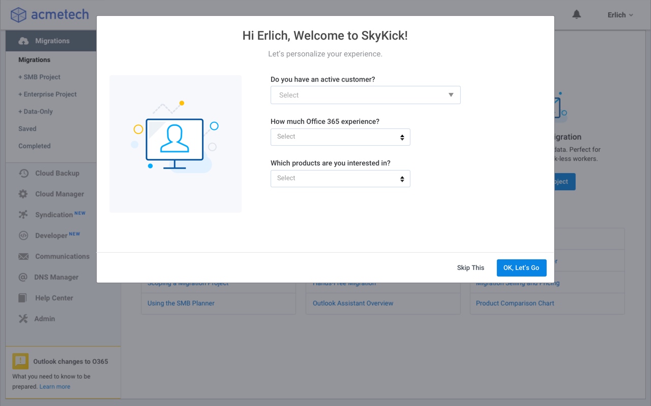
What We Delivered
What Improved
Added a clearer onboarding modal for new users
Contextual questions help direct users to the right place
Surfaced informational content based on onboarding questions
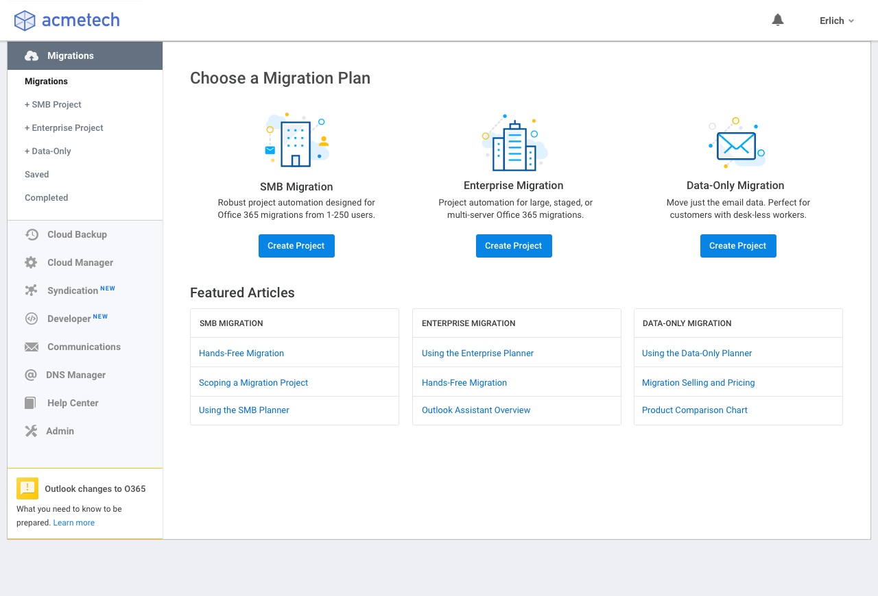
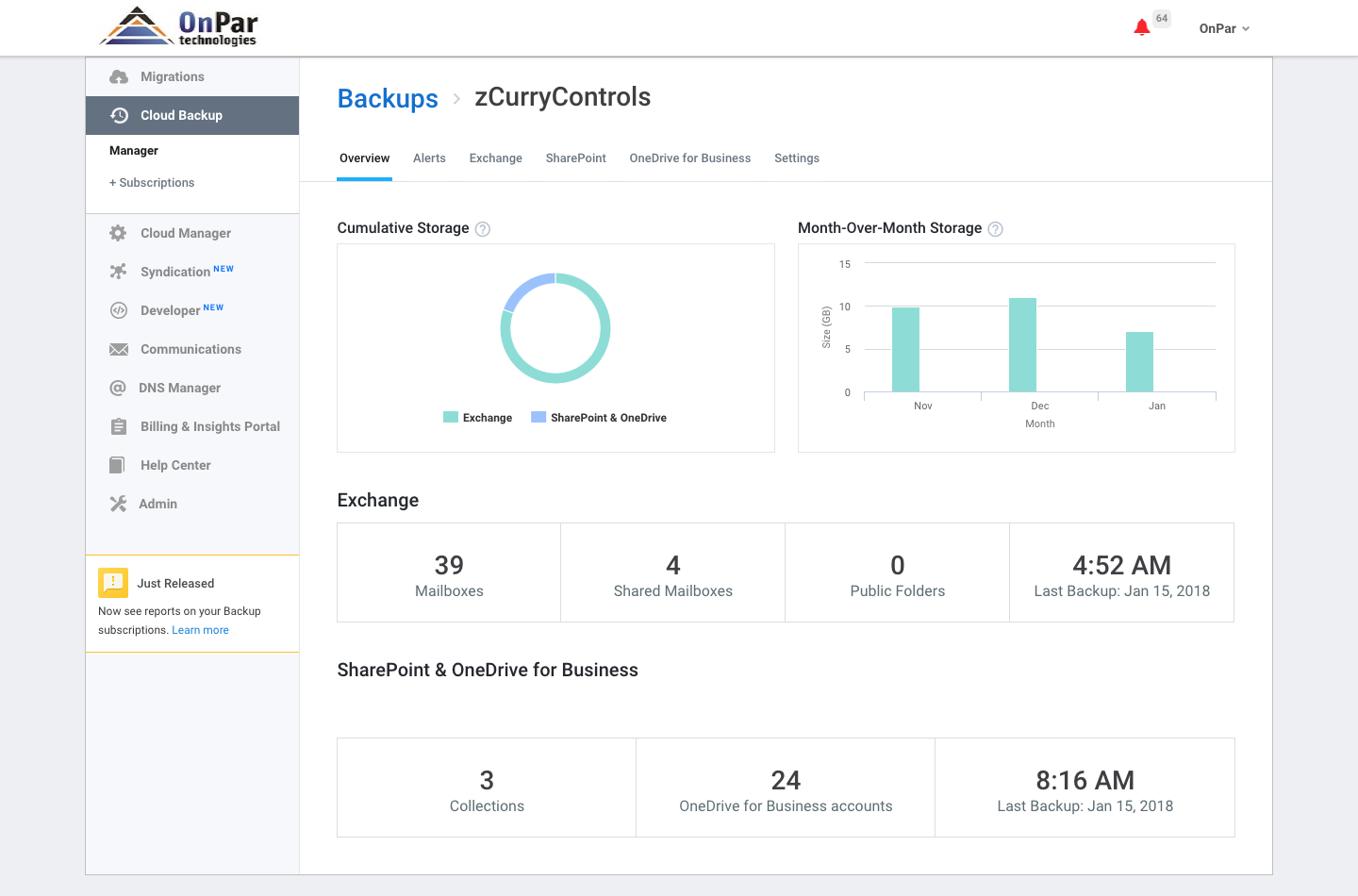
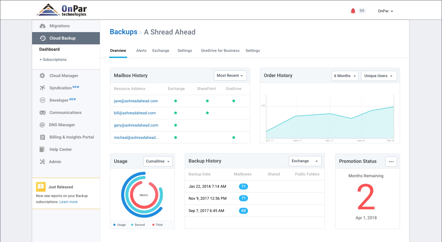
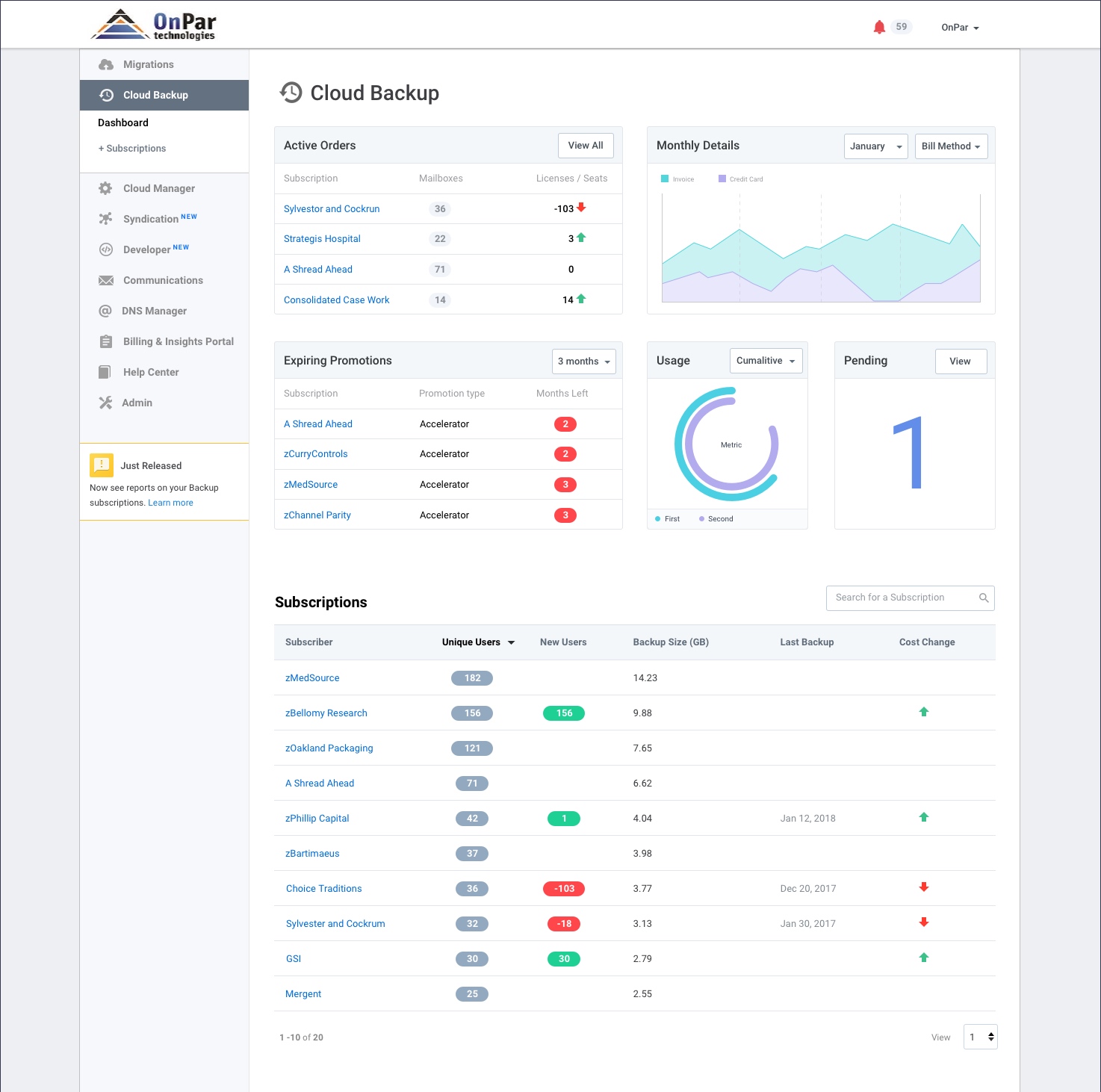
Previous Customer Dashboard
What We Delivered
What Improved
Dashboards are powered by user activity data
Utilized user feedback to deliver the most valuable datapoints
Impact
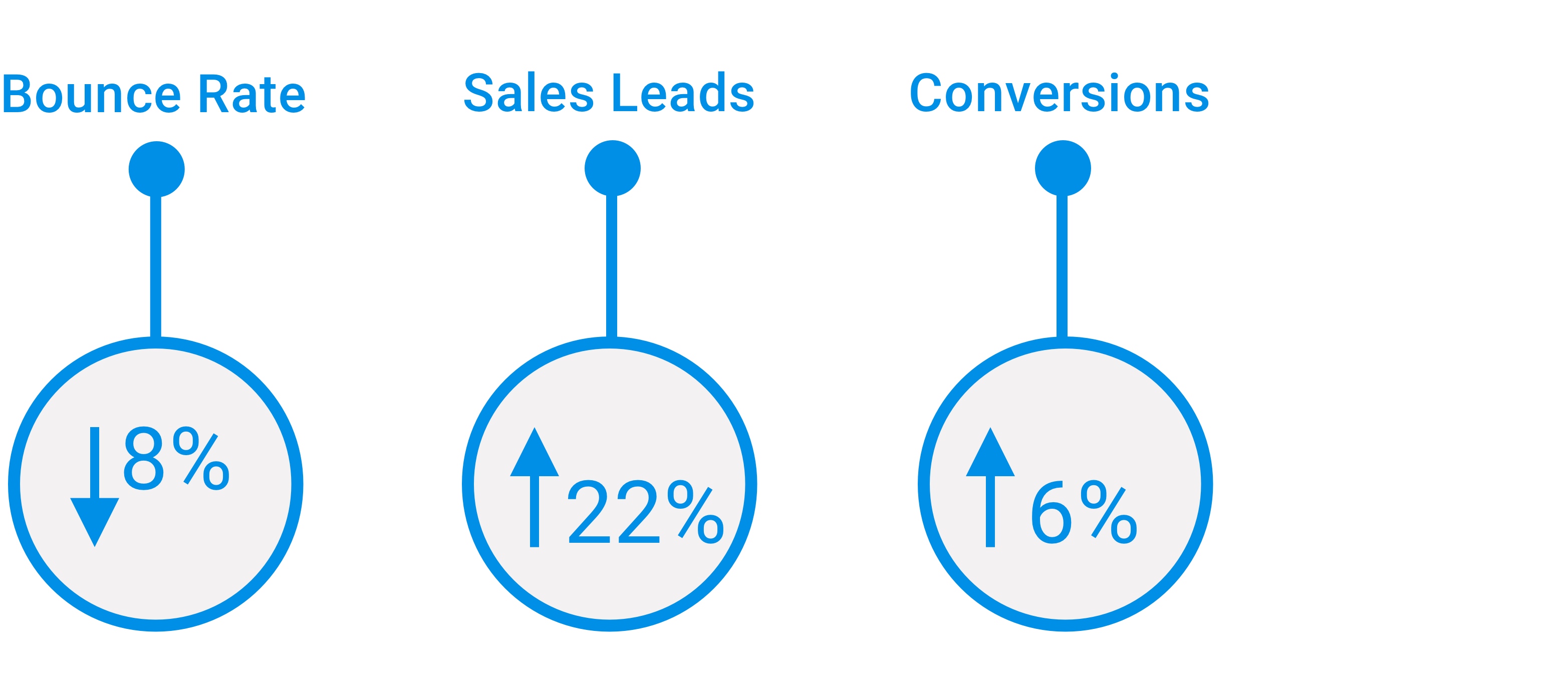
We were able to measure and see progress on our goals within a short period of time.
Validations & Learnings
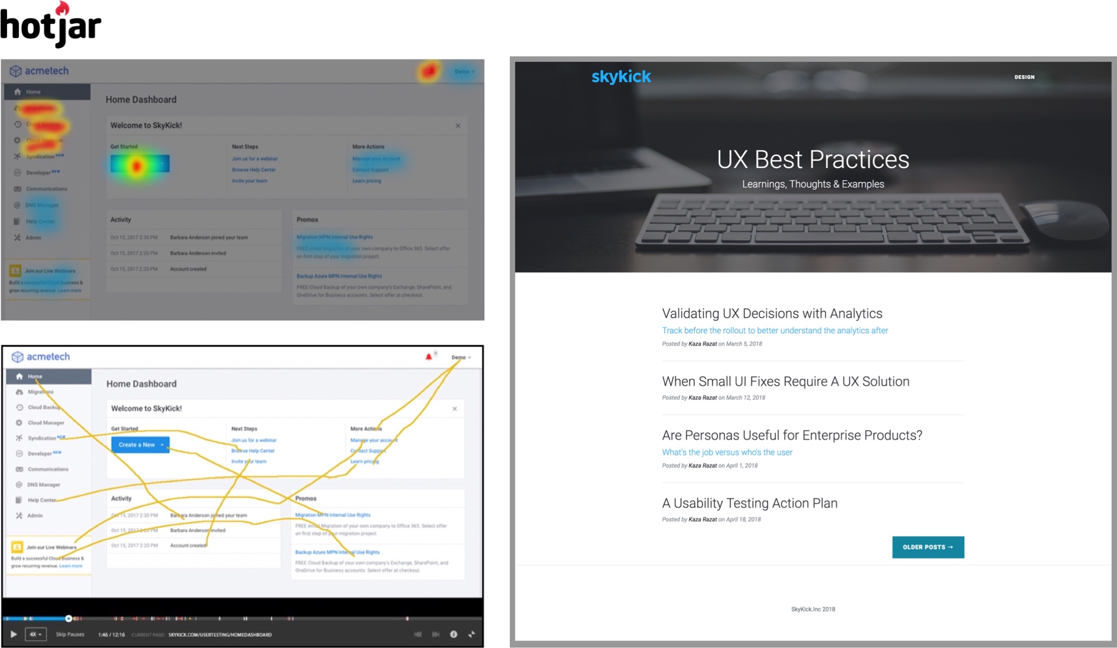
We tracked the validation and effectiveness of the new designs with HotJar using screen recordings and heat mapping. All of the research and learnings from the project were codified into an internal blog for the organization to read and learn from.



–