Description: A+E Networks produces nationally televised content for an estimated 98 million viewers. I was contracted to lead the design of A+E's suite of branded content apps, A&E, History Channel, and Lifetime, across all platforms, the first time the design and development of the apps had been brought in-house. My role was to ideate new features and lead a full visual overhaul to bring the apps in line with Apple's newly redesigned, flatter iOS look and feel.
WHAT'S THE PROBLEM BEING SOLVED?
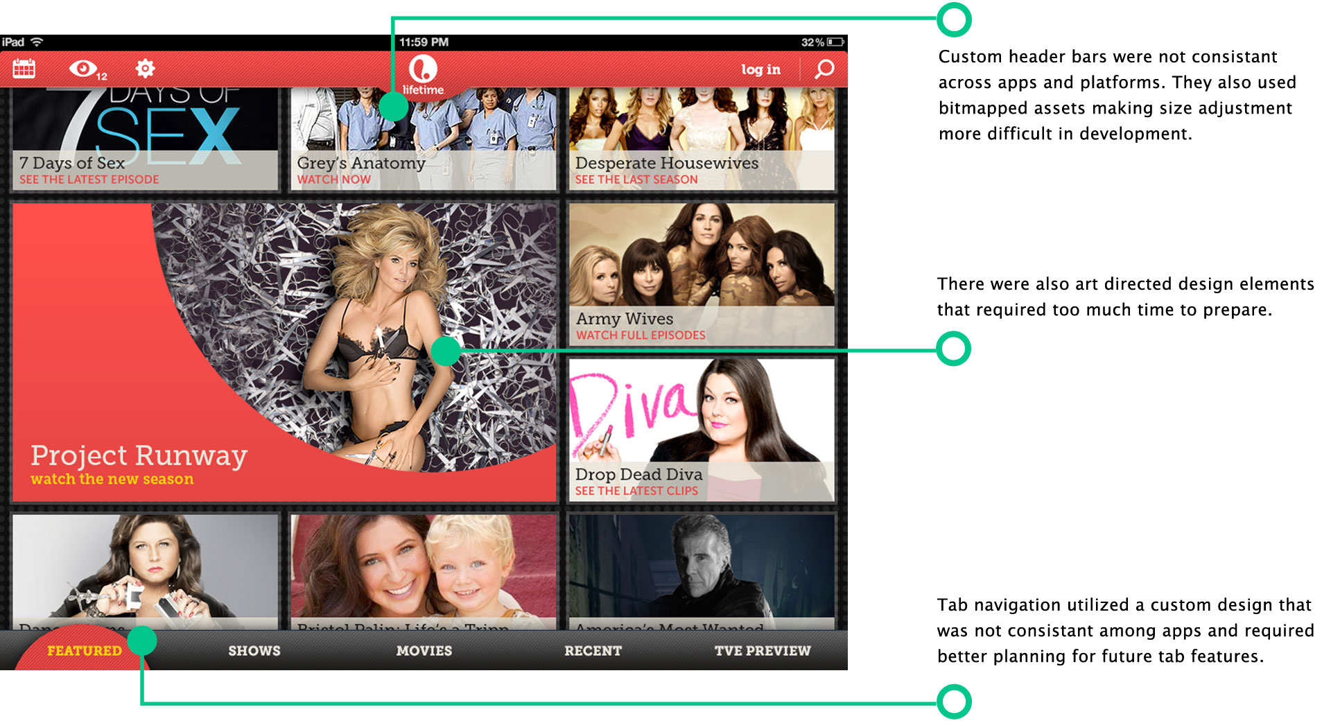
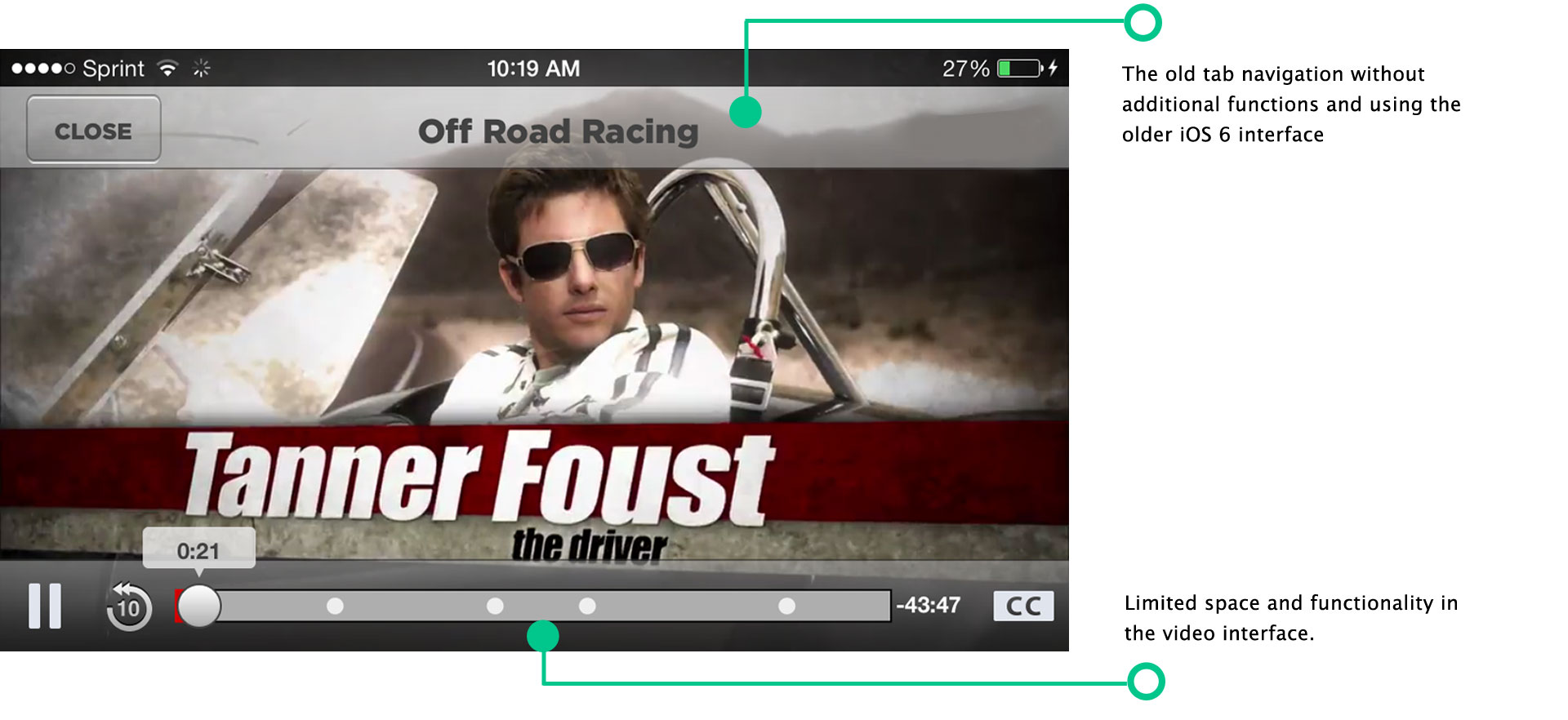
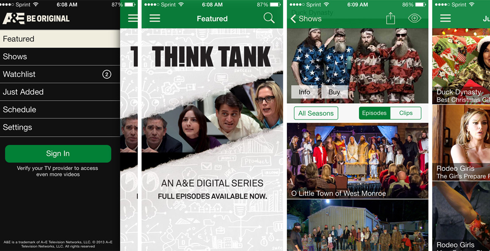
The A+E apps had all been designed individually with custom bitmapped graphics, a non-responsive layout, and interface elements built for an older version of iOS. When Apple shifted to a flatter, more modern visual language, the apps fell noticeably out of step with the rest of the operating system, and bringing the UI in line with that updated look and feel became the central problem to solve, all while introducing new product features into an already crowded and strained experience.
Before
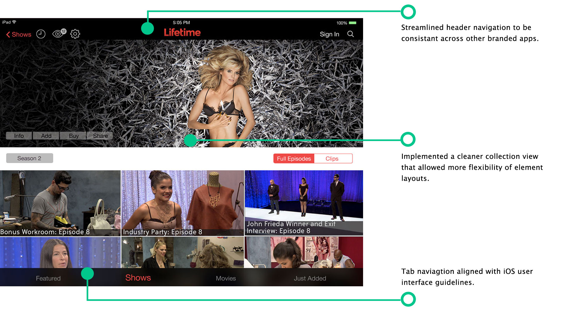
After
Before
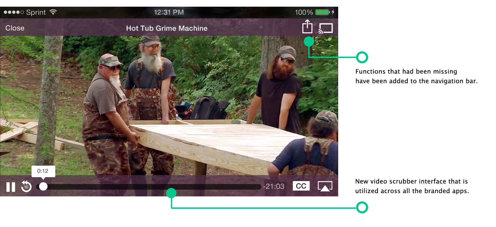
After
WHO ARE WE SOLVING IT FOR?
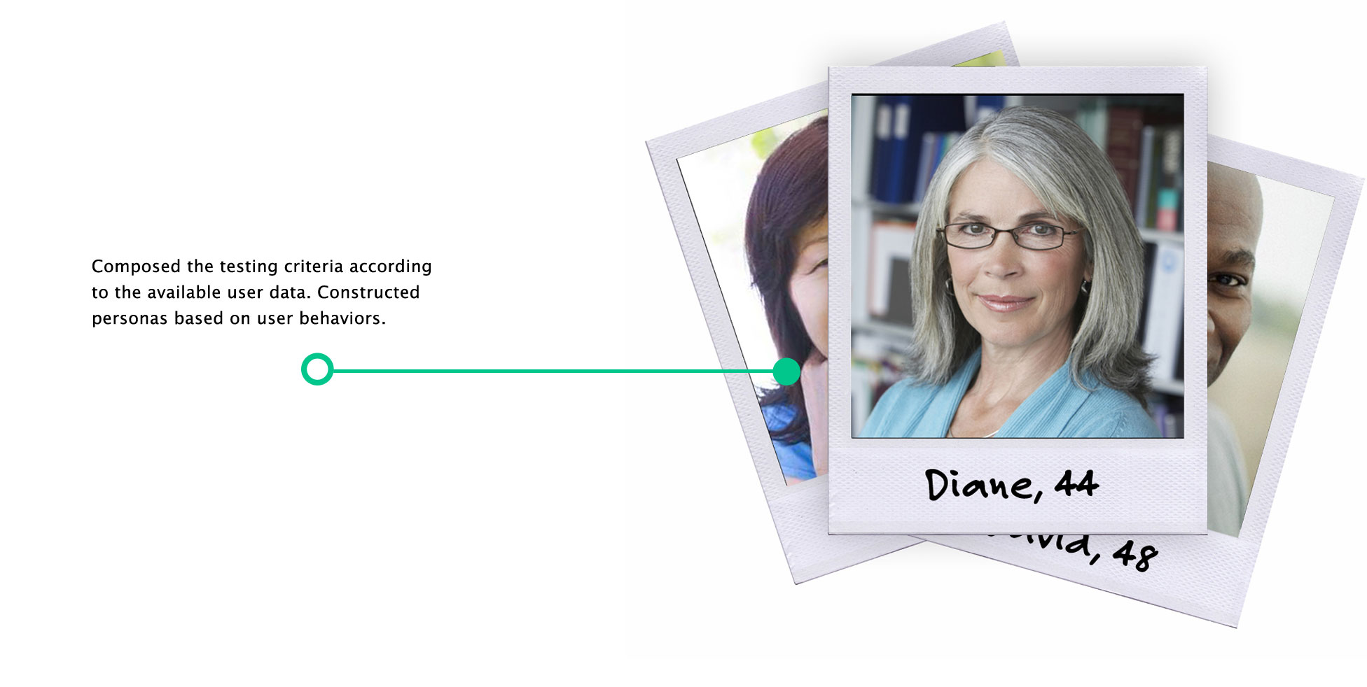
Viewers of the A&E, History Channel, and Lifetime apps who expected an experience as modern and consistent as the rest of their iOS device. There was limited actionable user data or behavioral insight inherited from the previous production company, so I built user personas to work from in its place.
HOW WE SOLVED IT
I updated and streamlined the interface layouts using templates to make content updates more consistent. The previous versions relied on custom, individually art-directed elements for each show, which slowed down development.
Interface Templates → Consolidation → New Features
Consolidation
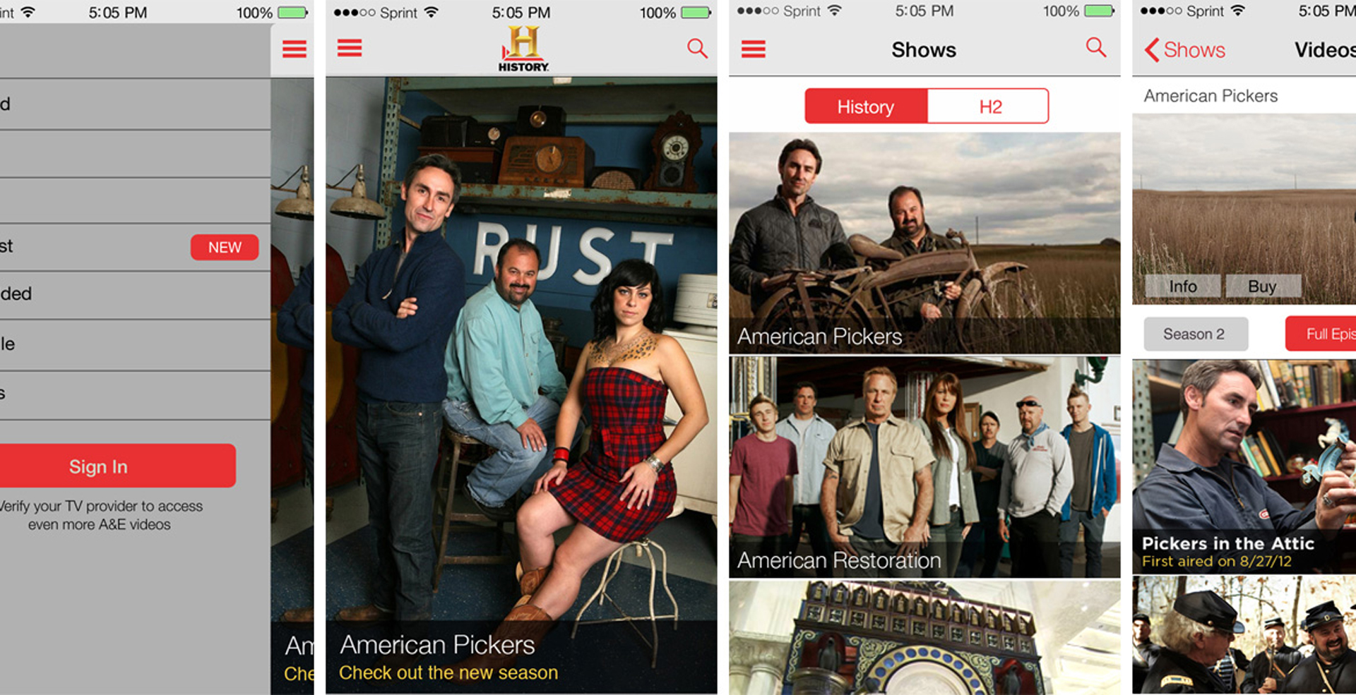
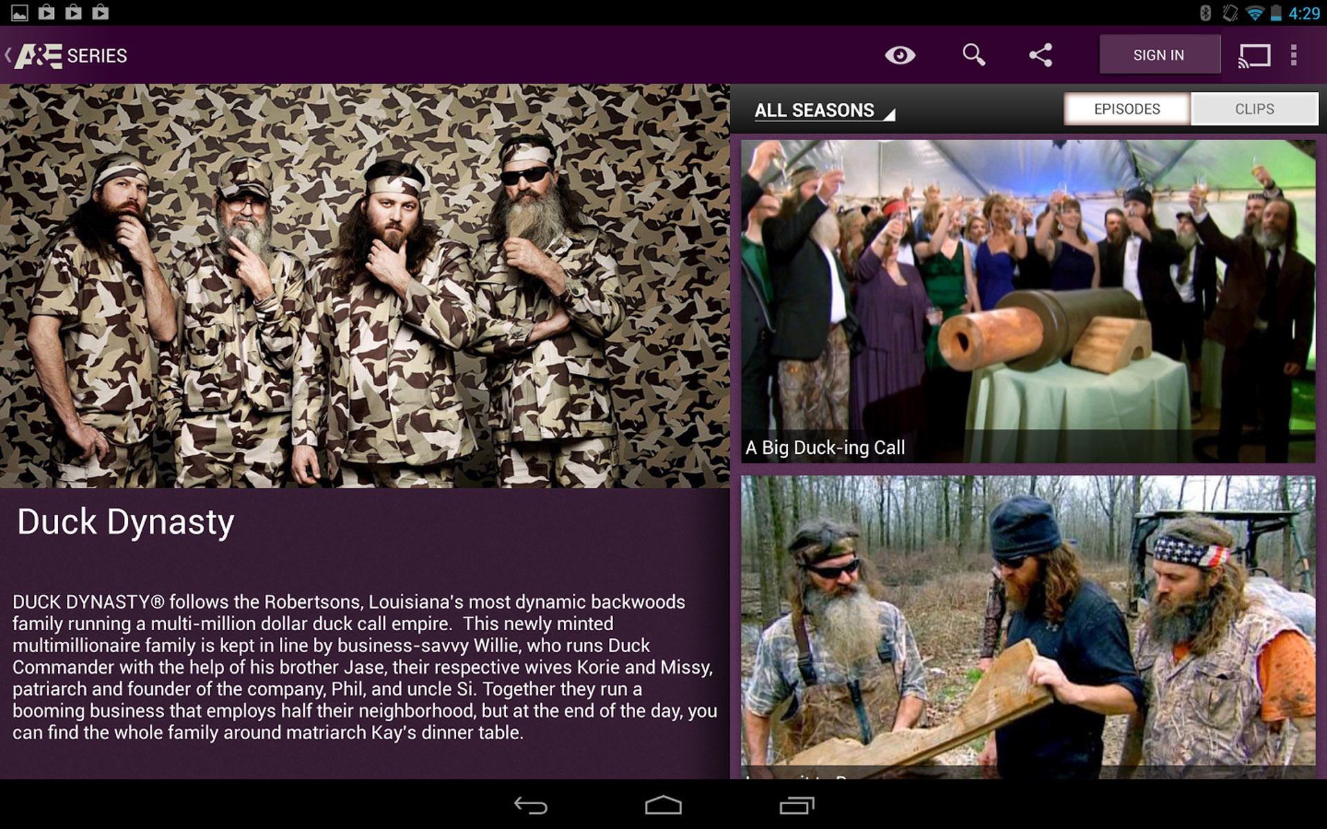
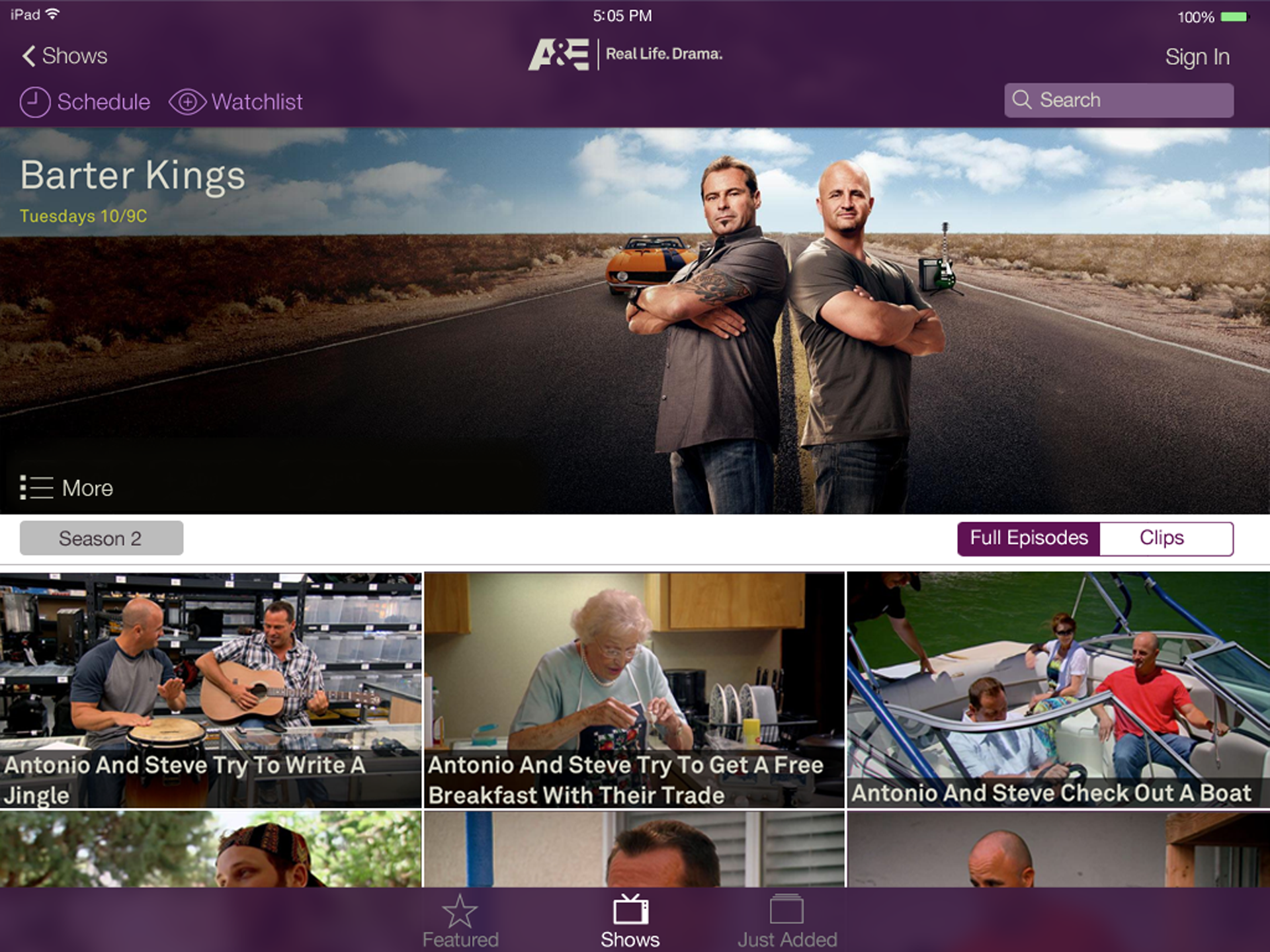
I led the design consolidation across A+E's family of channels, A&E, History Channel, and Lifetime. Although each channel had distinct branded shows, there was no compelling reason not to share a consistent layout across all three, especially as A+E rolled out new brand identities built around channel-specific colors.
The new approach to the UI consolidated the look and feel of the apps across
mobile platforms and the over-the-top box experiences.
Features
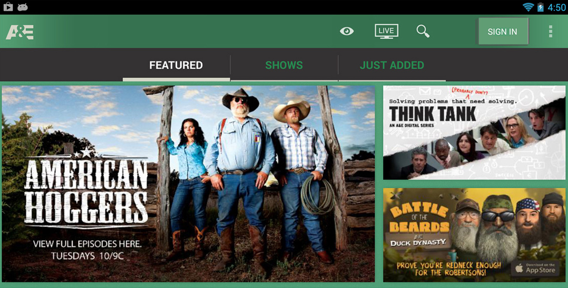
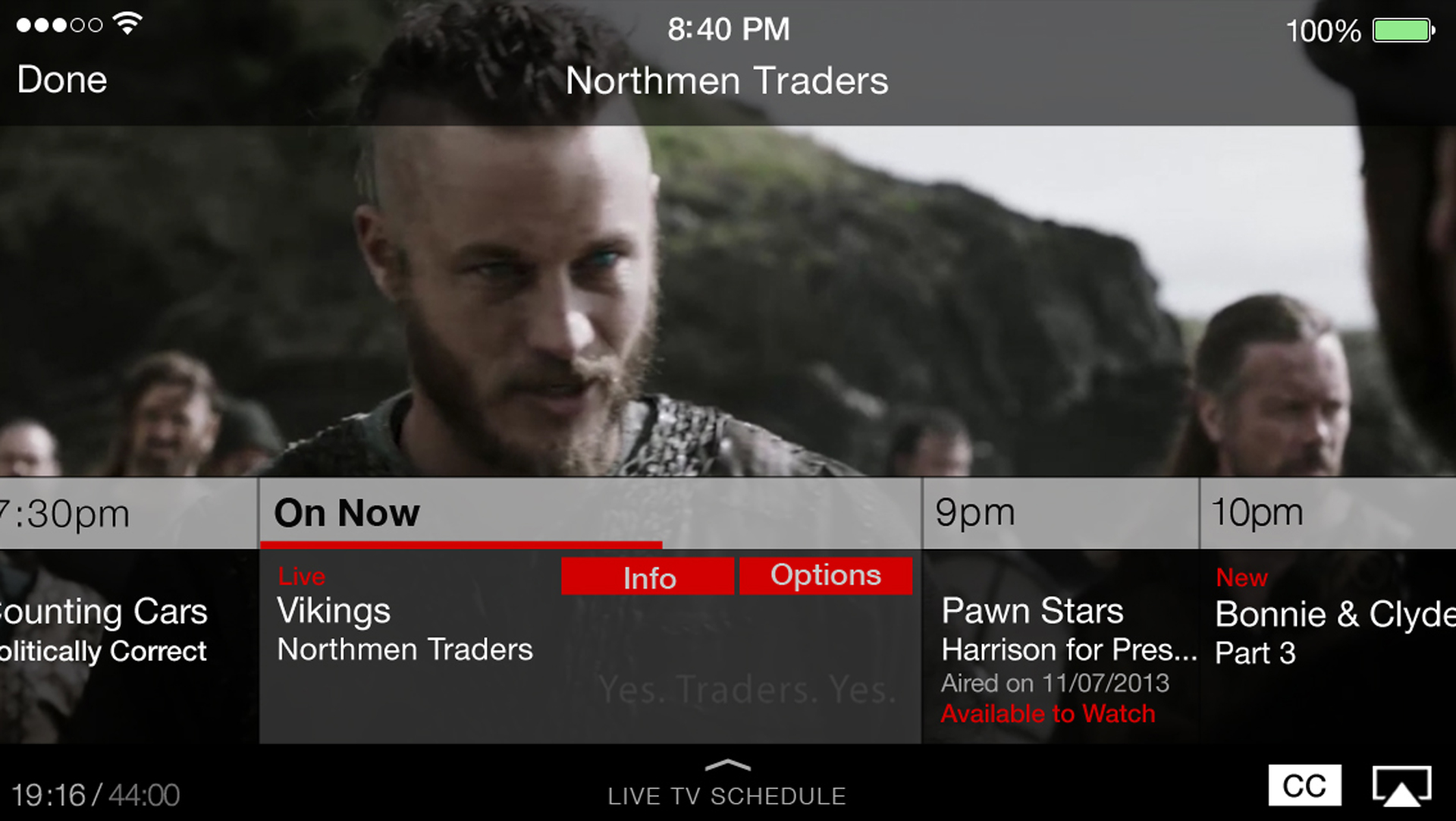
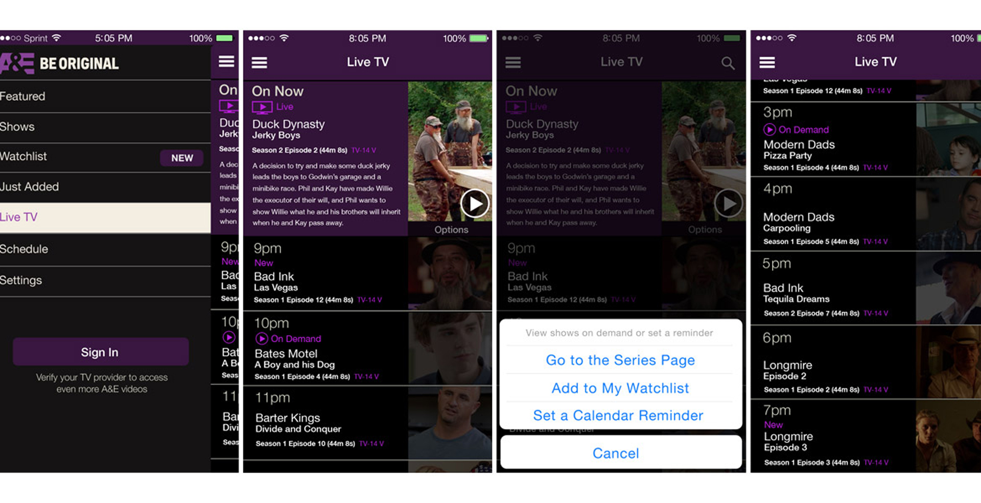
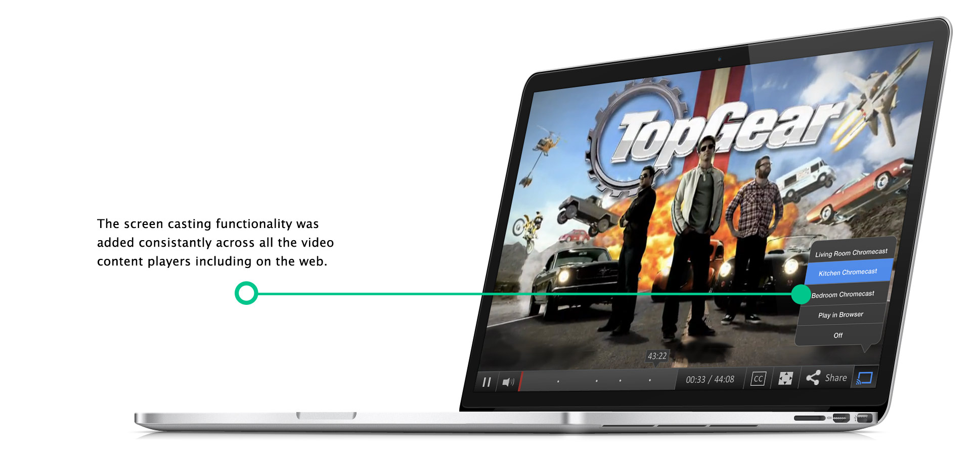
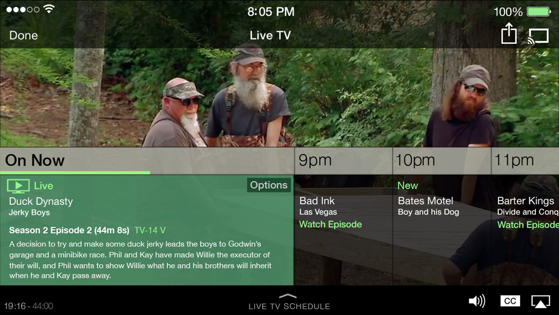
The addition of live TV streaming and Chromecasting were two of the major features I was assigned to explore and design.
Live streaming required a viewer guide interface that needed to feel seamless from phone to tablet. Finding the right design was complicated by the requirement to support both landscape and portrait orientations.
Process & Learnings
This project had a huge scope and a very aggressive timeline. I wore many hats, often acting as program manager as well as senior designer while and partnering closely with engineers to streamline the delivery of assets, which pushed me to pick up new productivity practices along the way, including:
the creation of design templates to support a suite of apps
the best practices for transitioning content management systems
design to engineering hand-off efficiencies across multiple mobile and set top box operating systems
WHAT WE LAUNCHED
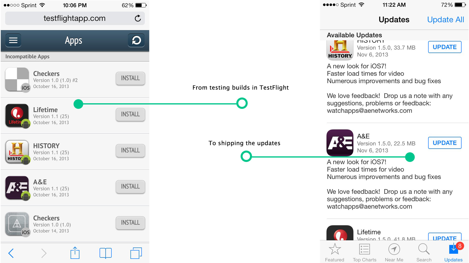
Successfully redesigned and shipped the A&E, History Channel, and Lifetime apps with an interface consolidated to match iOS's updated look and feel, along with new live streaming and Chromecast features.
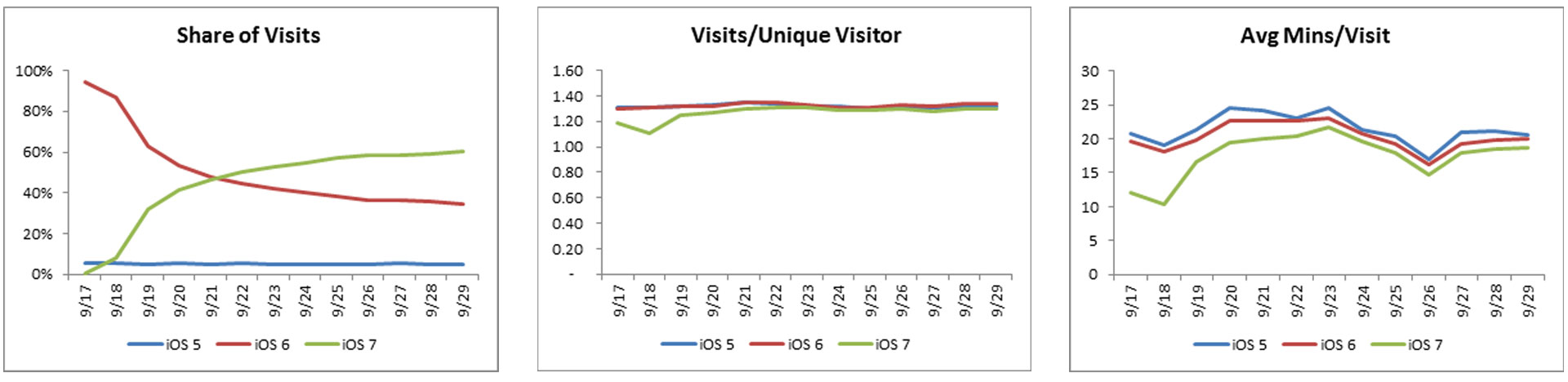
The keys metrics included tracking the transition of users from the iOS 6 version of the apps to the iOS 7 version, and tracking average minutes spent watching content per version.

–